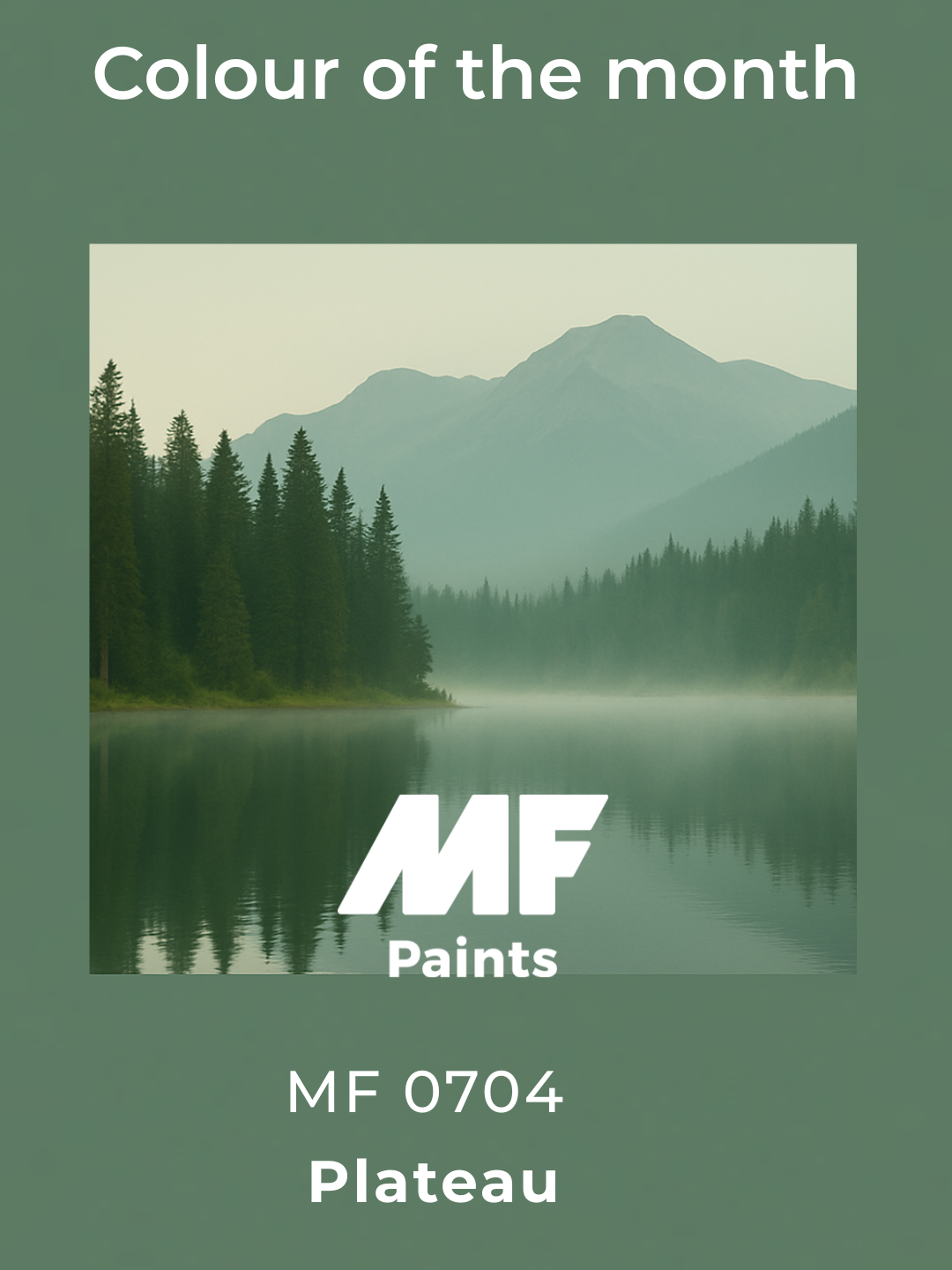
Plateau
Named color
of the year 2026 by
our designers!
Trendy colour of the year
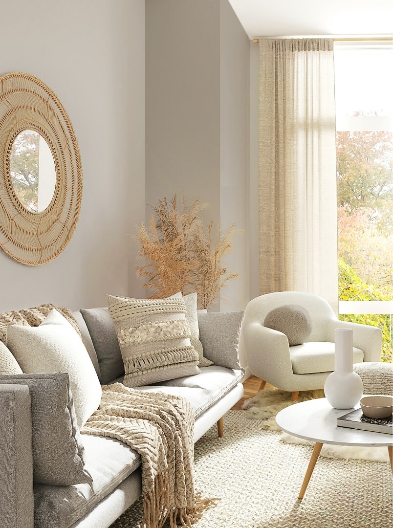
January: Plateau
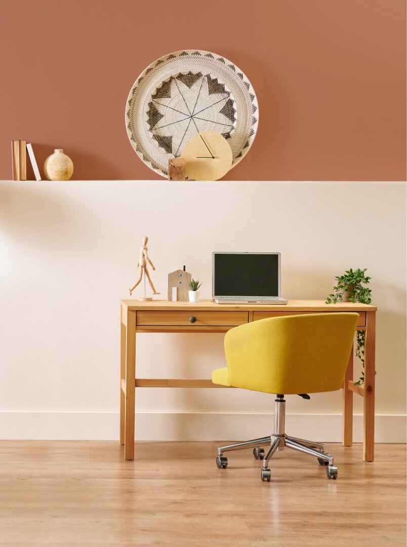
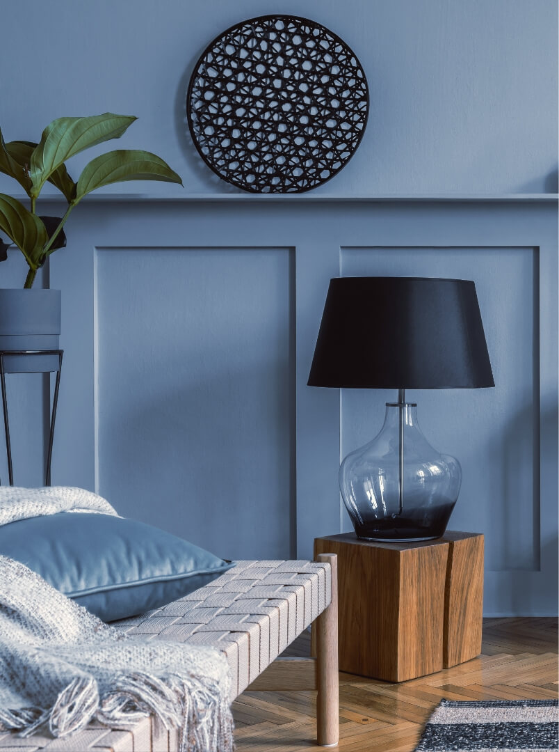
The year 2026 reflects a desire for stability and grounding, where we seek to slow down, breathe, and restore a lasting balance between contemporary design and inner well-being.
Plateau, a soft and enveloping shade, perfectly embodies this mindset. Inspired by vast, soothing landscapes, it evokes the quiet strength of nature and the beauty of raw materials.
Both understated and refined, Plateau blends seamlessly into any space, creating warm and balanced atmospheres. It invites us to refocus on what truly matters, to cultivate calming interiors, and to redefine the way we live in our spaces.
A symbol of timeless elegance, Plateau becomes the foundation of environments where comfort, serenity, and modernity naturally coexist.
Plateau
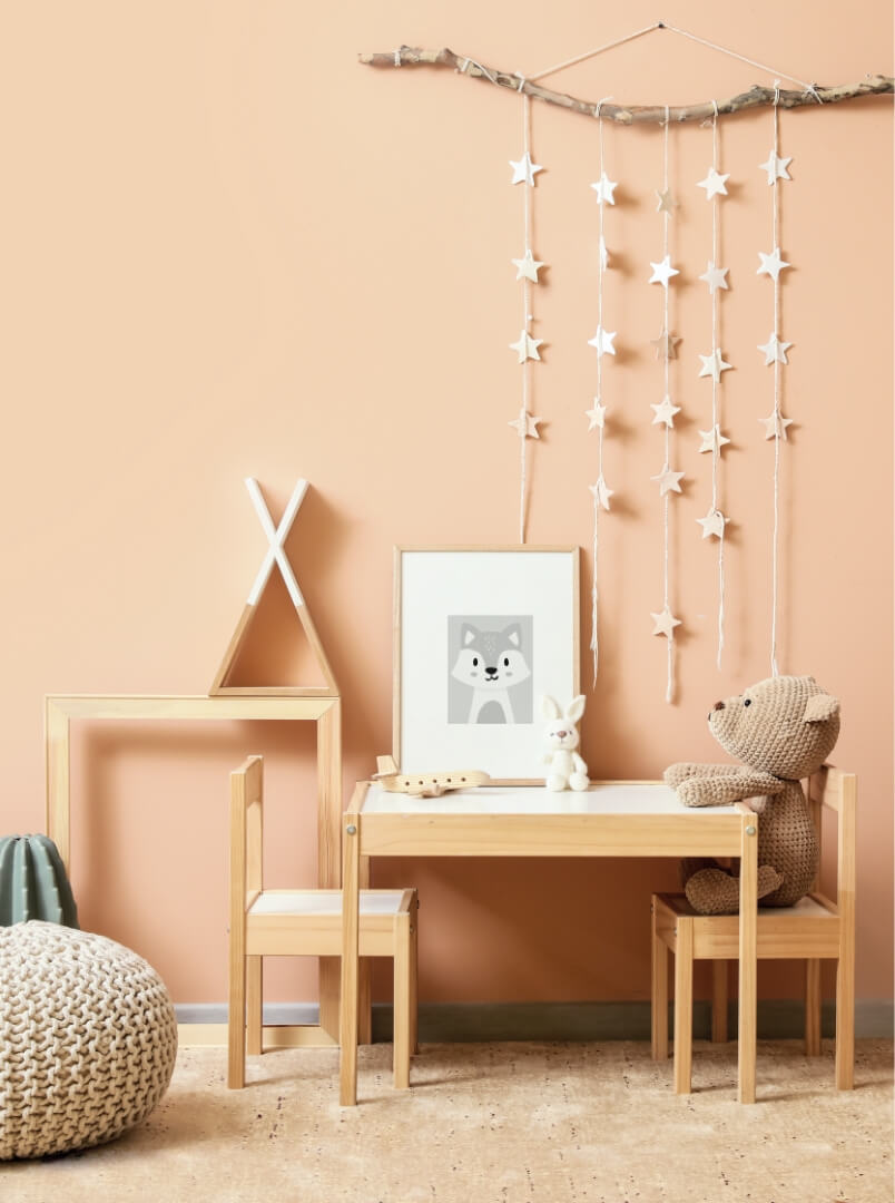
February: Dandy lion
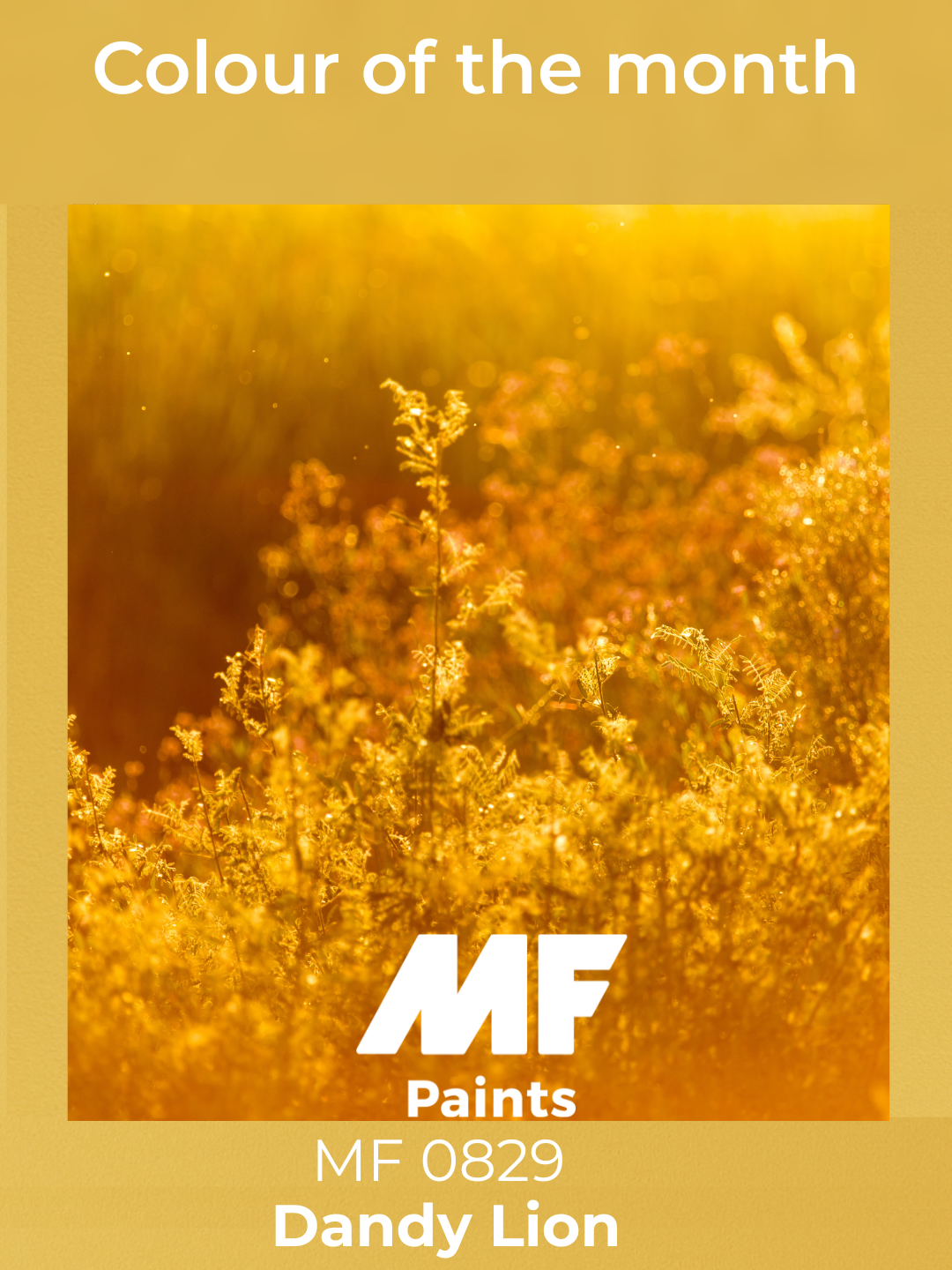
Dandy Lion
March: True Romance
Radiant, warm, and undeniably contemporary, True Romance is here to stay. At the crossroads of delicate pink and luminous orange, this vibrant shade instantly energizes any space.
Ideal for creating a lively and inviting atmosphere, it pairs beautifully with neutral tones like beige or soft gray, while also embracing elegant contrasts with sage green or golden accents.
Perfect for a dynamic living room or an inspiring workspace, it stimulates creativity and brings a beautiful boost of positivity! 🎨✨
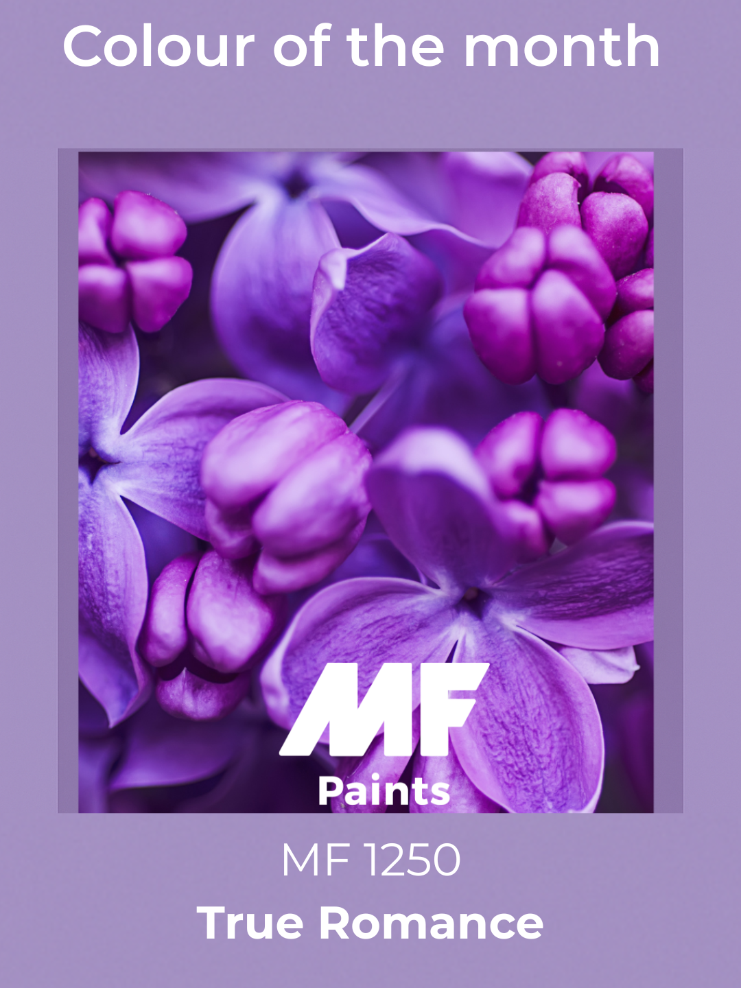
True Romance
April: Remaining Embers
Warm, enveloping, and full of softness, Remaining Embers continues to stand out. With its rich and comforting tone, it evokes the warmth of sunset landscapes while remaining elegant and timeless.
Ideal for creating a soothing and sophisticated ambiance, it pairs beautifully with neutral shades like beige or cream, and is elevated by natural materials such as wood or linen, as well as subtle golden touches.
A perfect choice for a cozy living room or welcoming space, where it invites relaxation and well-being! 🔥🎨
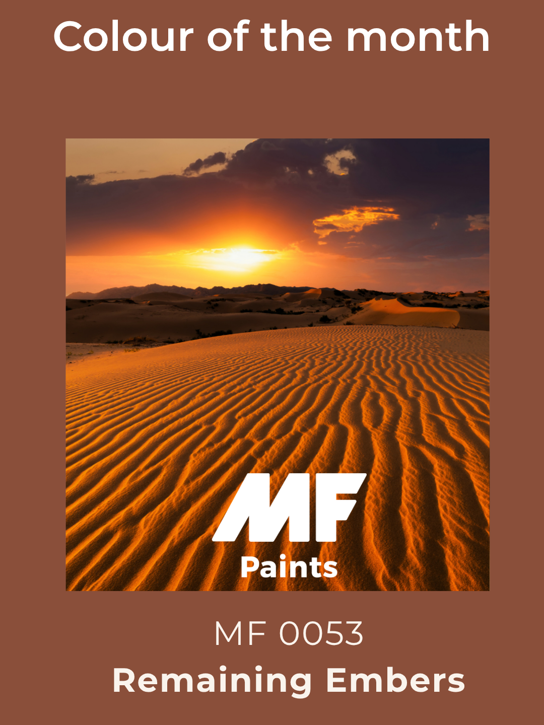
Remaining Embers
May: Caribbean Current
Refreshing, luminous, and captivating, Caribbean Current remains a standout. Both soothing and full of character, this blue inspired by tropical waters brings a sense of escape and lightness to any space.
Balanced and versatile, it pairs effortlessly with off-white, beige, or light gray, while shining alongside light wood or golden accents for a naturally elegant look.
Ideal for creating a serene living room or an inspiring office, it invites relaxation, clarity, and a sense of escape. 🌊✨
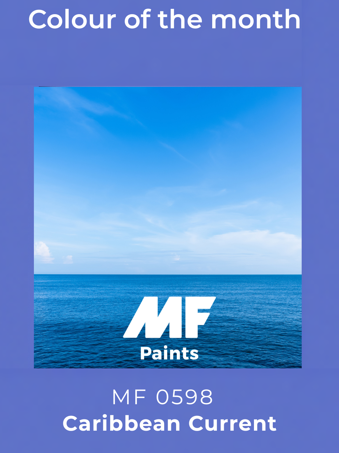
Caribbean Current
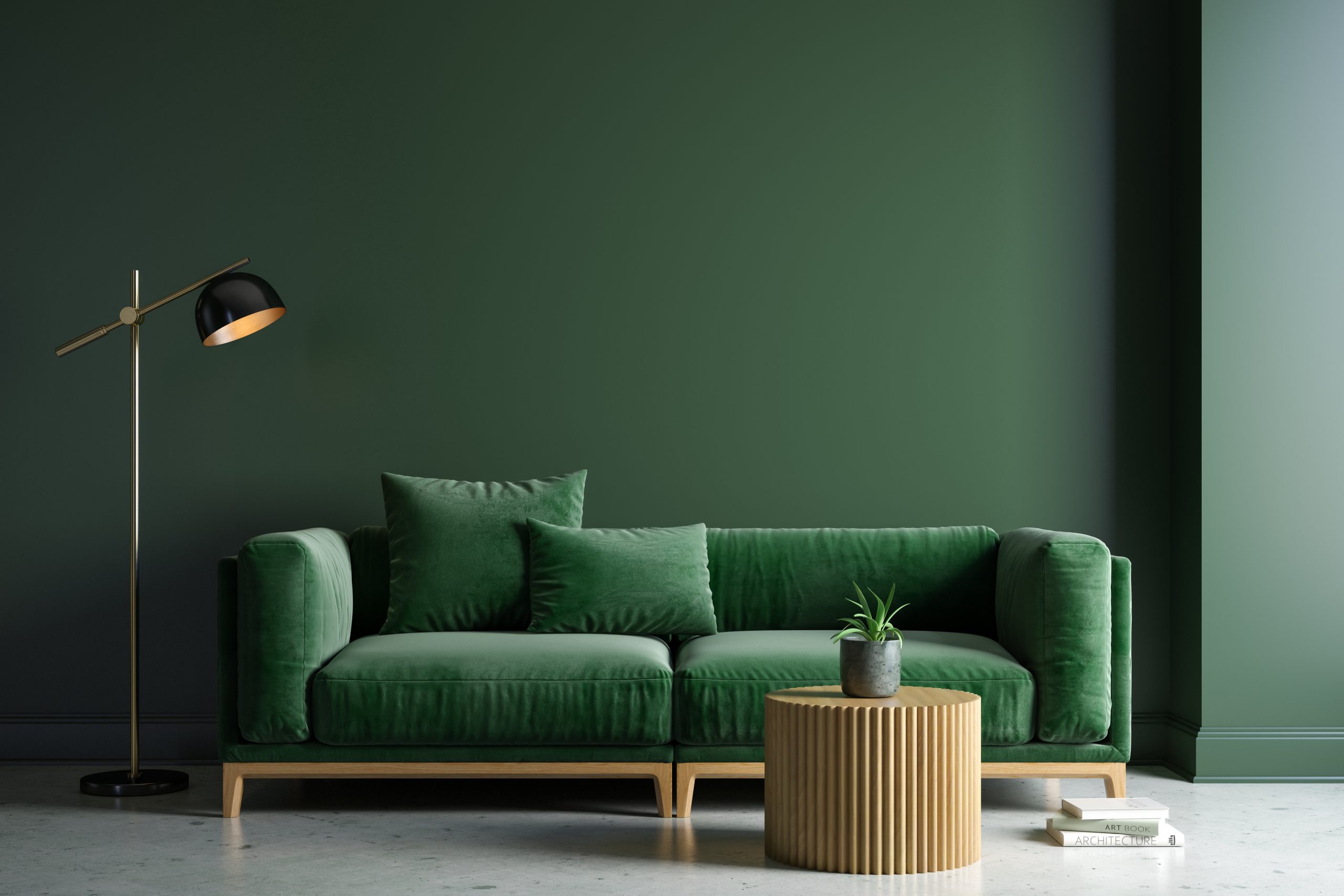
June: Melbourne
Fresh, natural, and revitalizing, Melbourne continues to impress. Blending deep forest green with the softness of calming foliage, this shade evokes the richness of nature and the balance of open landscapes.
Perfect for bringing a sense of well-being and stability, it pairs beautifully with neutral tones like beige, off-white, and natural materials such as wood for an authentic ambiance.
Ideal for a calming living room or open space, where it encourages relaxation and reconnection with what matters most. 🌿✨
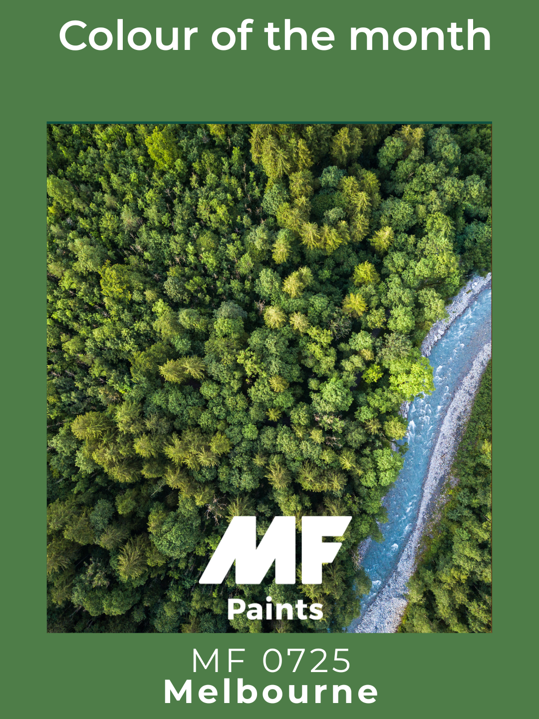
Melbourne
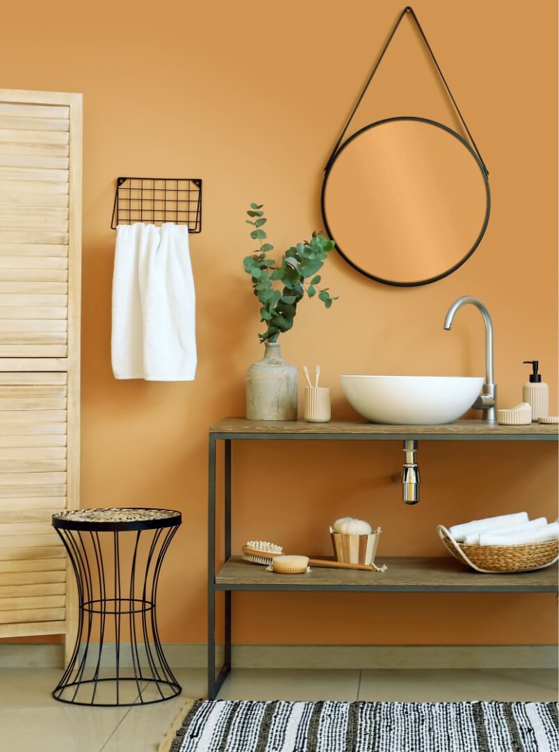
July: Orange you Happy ?
Warm, radiant, and full of character, Orang you Happy ? remains a bold choice. With its golden hues and vibrant orange accents, it evokes the energy of the sun and the warmth of shared moments.
Perfect for adding warmth to any interior, it pairs beautifully with earthy tones like terracotta, brown, or touches of cream for a cozy and enveloping atmosphere.
A great fit for a welcoming kitchen or cozy living room, where it radiates energy and comfort. 🍊✨
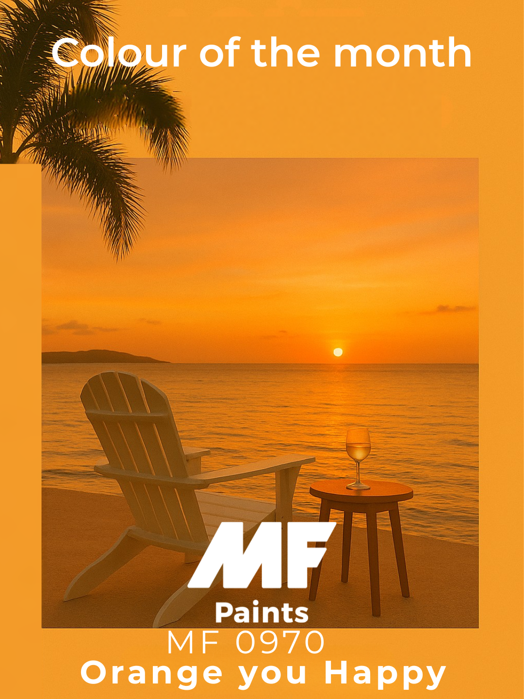
Orange you Happy?
August: Andes Sky
Elegant, modern, and full of character, Andes Sky stands out with refinement. With its subtle depth and timeless appeal, it balances between charcoal strength and anthracite softness.
Ideal for structuring a space with sophistication, it pairs beautifully with lighter tones like off-white or beige, as well as with metallic accents in gold or copper for a chic contrast.
Perfect for a contemporary living room or a minimalist office, where it evokes calm and elegance.
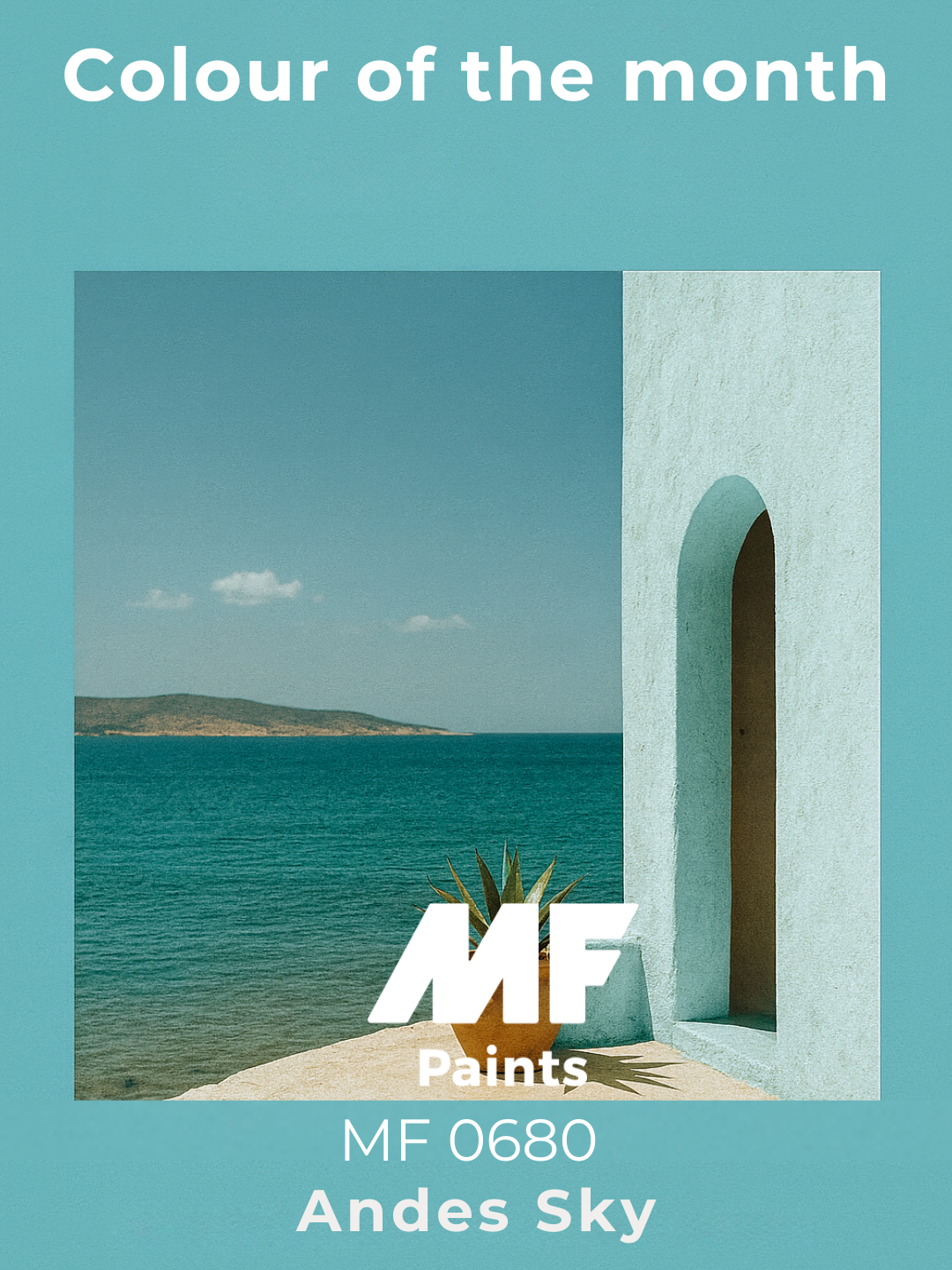
Andes Sky
September: Sun’s Rage
Bold, radiant, and captivating, Sun’s Rage makes a strong statement. Combining enveloping warmth with luminous intensity, this shade reflects the power and energy of the sun at its peak.
It instantly energizes a space while maintaining a refined elegance. Perfect for creating a vibrant and welcoming atmosphere, it pairs beautifully with neutral tones like beige or sand, and becomes even more expressive alongside natural materials like wood or golden accents.
Ideal for a lively living room or creative space, where it brings energy, warmth, and personality! 🌞✨
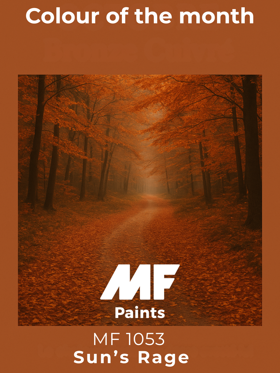
Sun's Rage
October: Pretty Parasol
Elegant, luminous, and delicately soft, Pretty Prasol embodies natural refinement. Sitting between subtle rosy tones and warm undertones, it creates a gentle and inviting atmosphere.
Perfect for adding light while maintaining sophistication, it pairs beautifully with neutral shades like beige, off-white, or soft gray, and is enhanced by golden accents or natural materials for a refined finish.
Ideal for a bright living room, serene bedroom, or minimalist space, it invites relaxation and harmony—a soft and timeless choice! 🎨✨
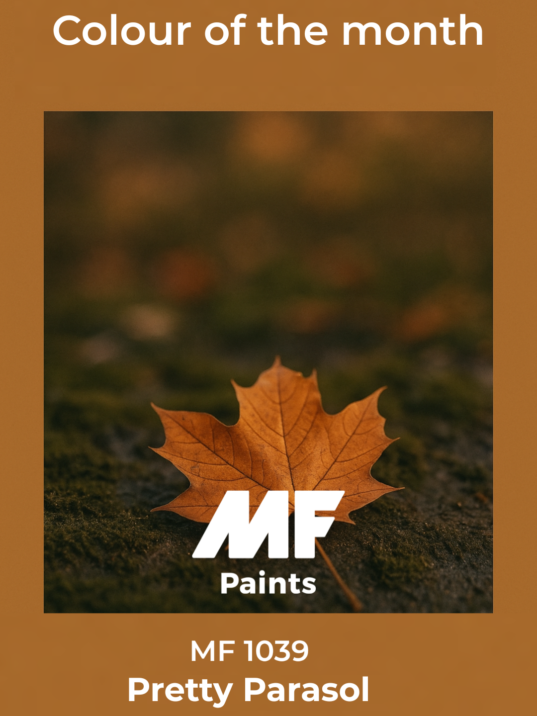
Pretty Parasol
November: Alchemy
Alchemy, a warm and subtly golden shade, evokes the richness of natural materials and the softness of changing seasons.
Both enveloping and luminous, it creates calming and balanced spaces, perfect for moments of connection or relaxation.
Naturally pairing with deep blues, soft terracottas, and organic textures, Alchemy casts a warm glow across walls, textiles, and decorative accents.
Appreciated for its timeless elegance and comforting effect, this color invites us to slow down, refocus, and bring gentle warmth into everyday life. ✨🎨
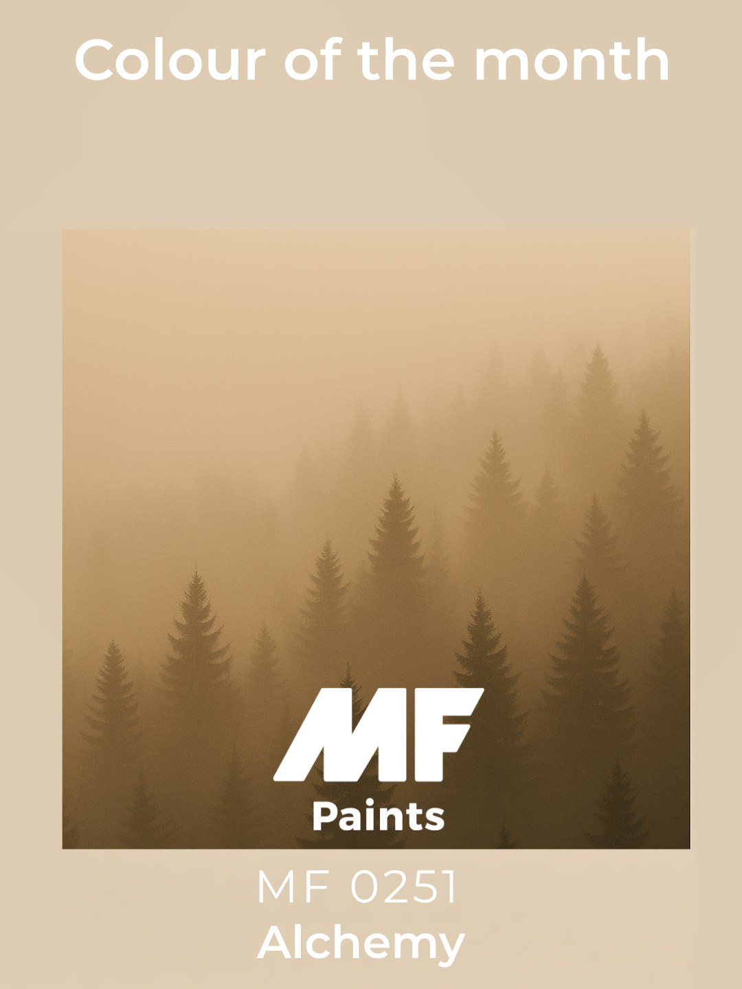
Alchemy
December: Simply Sparkling
Simply Sparkling, a luminous and refined shade, evokes the clarity of a delicate glow and the lightness of precious moments. Balancing subtle freshness with controlled brilliance, it captures a modern and timeless elegance.
Whether used on walls, textiles, or decorative elements, Simply Sparkling brings a soft and radiant atmosphere, filled with finesse and sophistication. It pairs beautifully with neutral tones like ivory or beige, and is enhanced by natural materials as well as touches of gold for a chic yet calming ambiance.
Simply Sparkling embodies a spirit of lightness and elegance. More than just a color, it is an invitation to brighten your space, create refined atmospheres, and add a subtle touch of brilliance to everyday life. ✨🎨
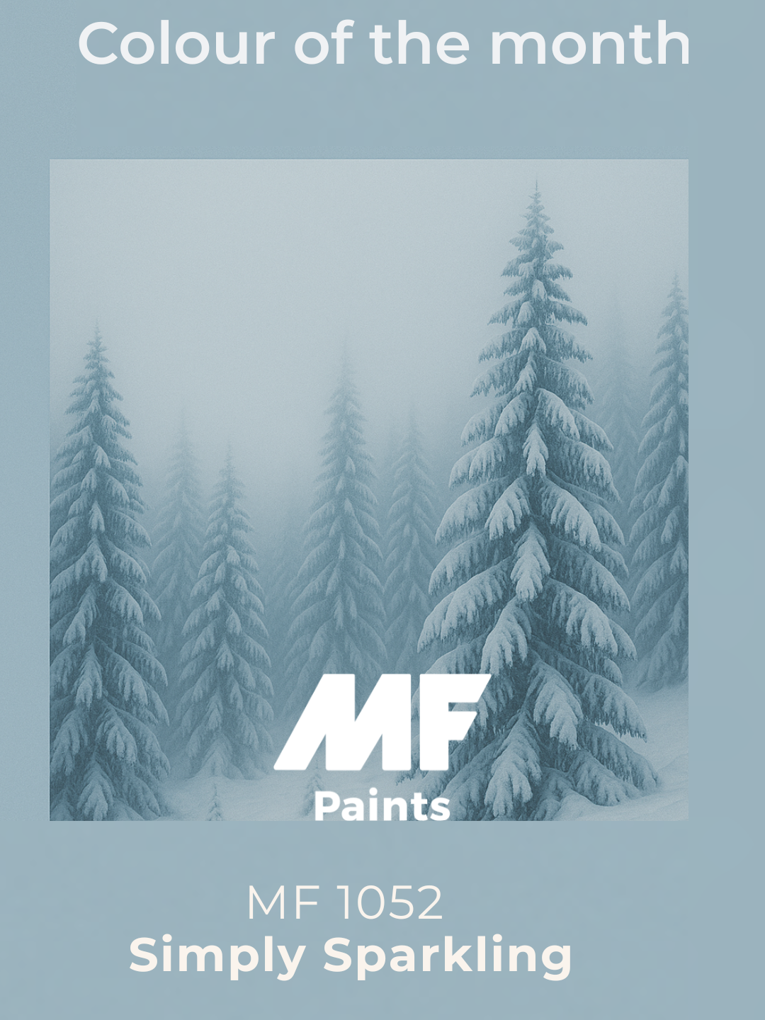
Simply Sparkling
Find the retailer closest to you!
Find a retailerSimple Serenity