Have you already begun working on professional projects for next year? Take inspiration from our 2026 colour palettes when planning your interior design or renovation. These palettes have been specially designed for painters, architects and designers.
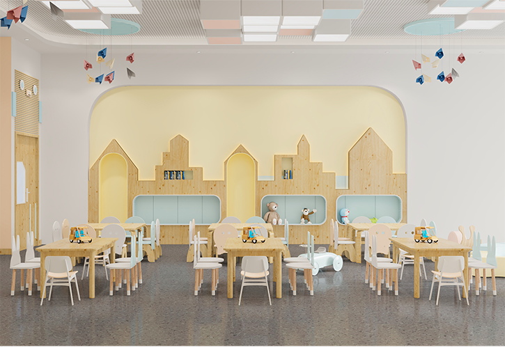
The early years
Colour plays an important role in the design of learning environments, from early childhood onwards. Yellow is the ideal hue to create a positive atmosphere and stimulate the moods of young children. Combine these tonal colours to create a soothing harmony that promotes concentration.
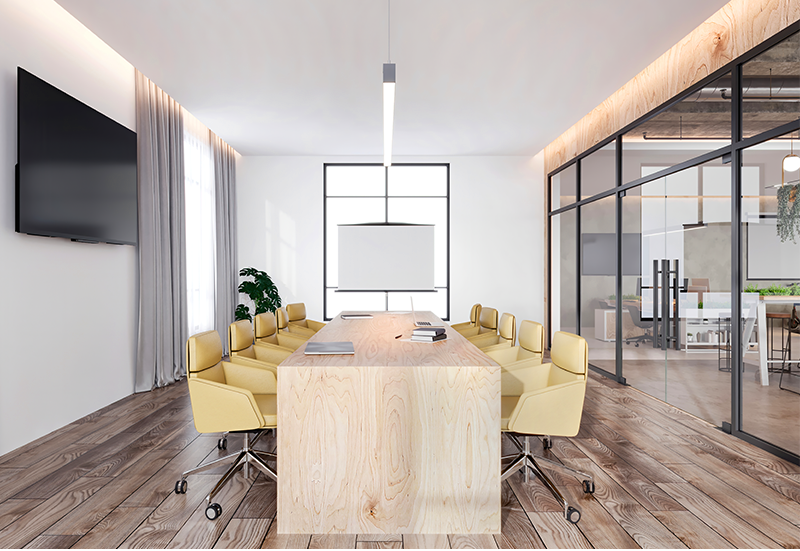
Offices
With biophilic design, tune into nature and create healthy working environments. Inspired by the lush beauty of nature, this trio of natural greens harmonizes with an understated green-yellow. White and soft black add uplifting light and a soothing grounding effect to offices. Imbue break rooms with the well-being essence of nature using colour combinations designed for relaxation.
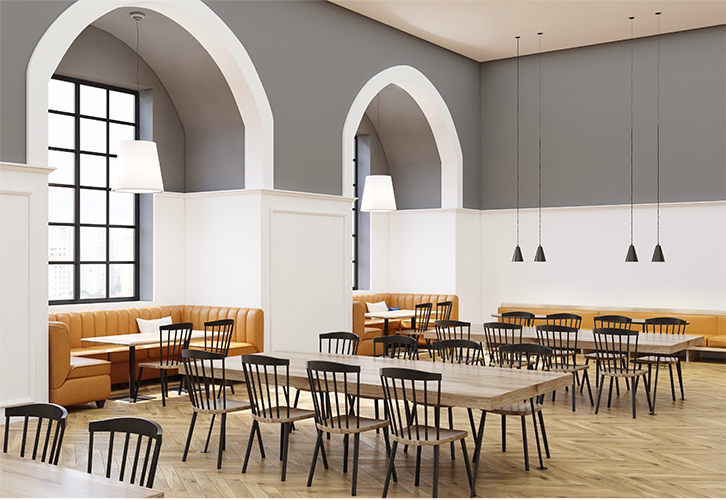
Hospitality
Explore minimalism with sophisticated elements. This palette focuses on harmony and balance for reception areas, dining rooms and guest rooms. Specifically created for the hotel industry, this palette highlights the beauty of clean lines, in changing hues.
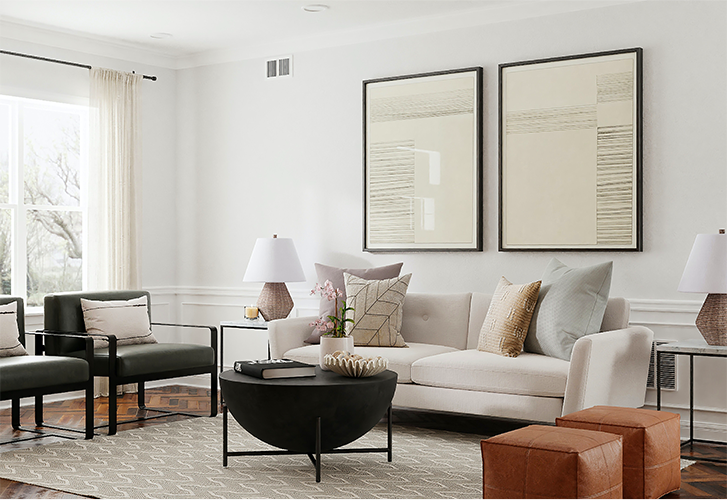
Residential
The classic monochrome scheme of black and white has been updated for 2024. Give your residential projects a contemporary enhancement using colours that add understated elegance into any home. For a warm yet sophisticated ambience, subtle tone combinations are timeless and reliable.
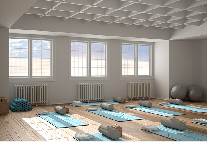
Wellness
Although we tend to think of green for relaxation areas, blue spaces are becoming increasingly popular in the design of rooms focused on well-being. Relaxation spaces such as spas and retreats are perfect for this palette of natural blues. Inspired by natural colour complements derived from seas and shorelines, invoking the harmony of ocean blues and stone grays.
Communal spaces
Since the pandemic, clean, natural environments have become the design norm for common spaces. This blue green palette balances soft, light tones, nurturing motivation and enhancing cognitive and physical performance at work. This palette is perfect for open spaces and transitional areas such as corridors and vestibules. Darker shades can be combined with lighter accents to further enhance the atmosphere of clarity and concentration in communal spaces.
